 Data helps organizations gain valuable insights into customers, employees, products and markets, but there is a limit to what databases and charts can do on their own. Opportunities or answers to organizational problems don't just organically spring from algorithms”they need communicators to translate the information into compelling stories. It is the stories built from data that ultimately bring about action and change. Applying simple story techniques to data transforms it, from making sense to also making meaning. Adding meaning helps audiences understand the data and drives real change for business. Easy, right? The good news is that there are three story techniques to make data stick in the hearts and minds of audiences and inspire them to action.
Marvel at the magnitude
The numbers we use often are on such large or small scales that they are hard for even the most data-savvy among us to comprehend. How can we envision how large or small something is that we can't see with the naked eye? Help your audience visualize and comprehend data by comparing them to familiar things. For example, if sales of your product dropped by a million units, convert that very large and hard-to-fathom number into something that is relatable. Perhaps that much product could fill the Empire State Building or half of Wrigley Field. Those concrete examples make the magnitude much clearer. Additionally, don't be afraid to express how you feel about the data. Let your emotions about the outcomes show. If you set a huge goal and the team reached it, marvel at their Herculean effort by marveling at the data and showing how you feel. You could gasp, clap, and use exclamatory phrases like , wow, boom or, yowza.
Humanize the characters
Most organizational data sets wouldn't exist without humans generating them. We are buying and selling goods, clicking on links, wearing devices, undergoing medical tests, and selling homes. Empathetically understanding the people whose actions generate your data will help you better communicate with them. Identify who the , hero in your data is”this could be a customer, user, employee, or someone who is doing something positive and driving numbers up. Then identify the , adversary, or the party who is making it harder for the hero to achieve his/her goal. This could be a competitor, the media, a mindset, or anything that stands in the way. Telling the story of a hero struggling against an adversary is classic storytelling. Getting an audience to root for the data hero and willing to help resist the data adversary makes others much more likely to be invested in and motivated by the data story. For example, if the data shows customer purchases are slowing down, your hero (your customer) has gotten stuck in some way and something may be wrong. Your adversary could be your pricing model, your product or even a shopping cart upgrade that's causing frustration. Communicate data in a way that makes others want to bust through the barrier your hero is encountering. When we personify data, we attach meaning to it and make it memorable.
Understand data's emotional arc
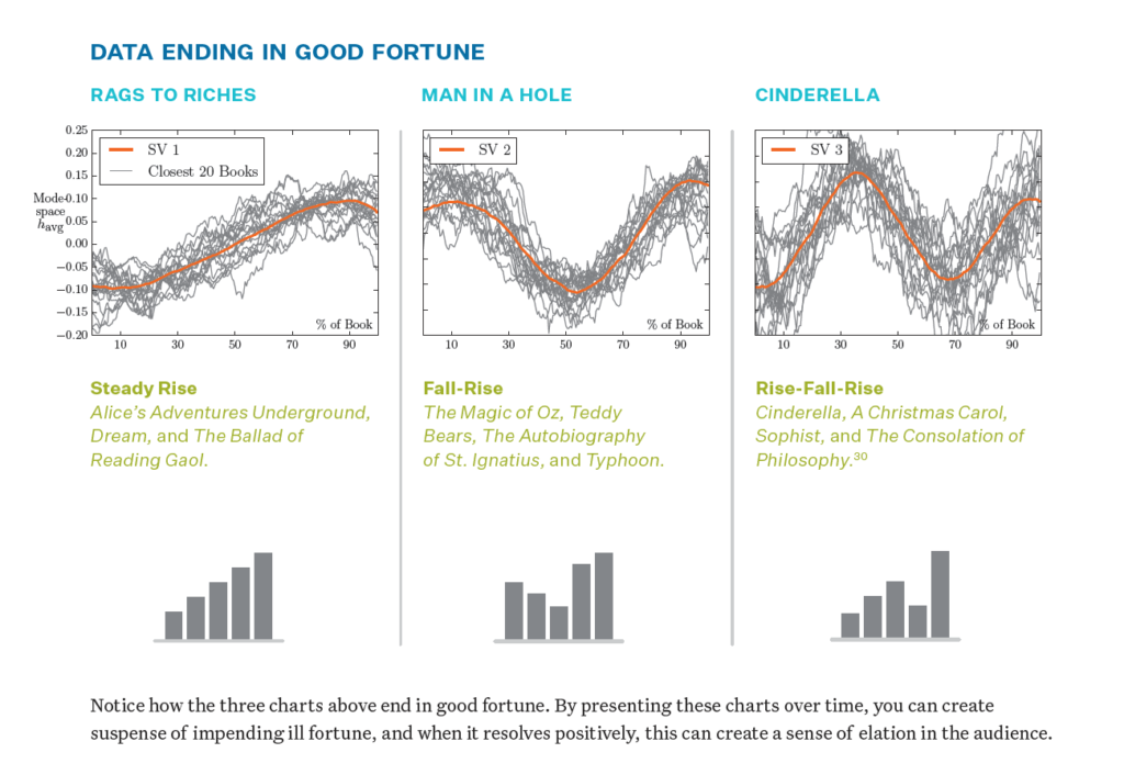
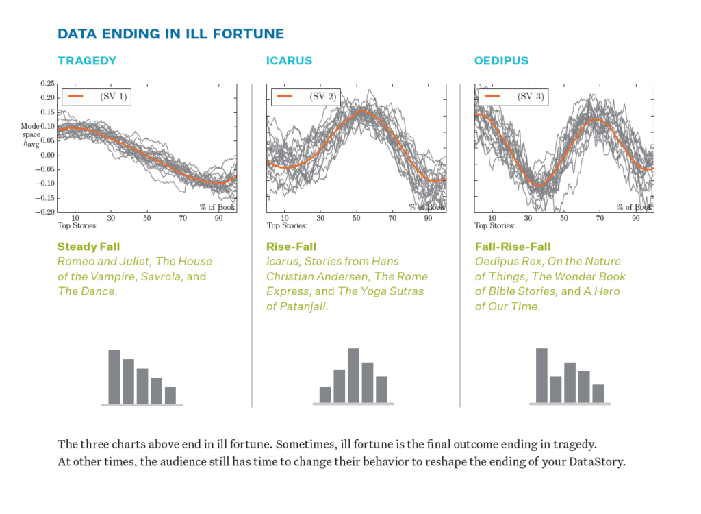
All stories have an emotional arc, and data stories are no different. Charts that represent business results often report an organization's good or bad fortune over time, which is not so different from a character's fortune over the course of a story. In 2016, a team of scientists at the University of Vermont tested a long-held theory of novelist Kurt Vonnegut's that story arcs could be mapped and tracked by analyzing the emotional arcs of 1,327 works of fiction. Their findings produced six prevalent emotional arcs: Three of them end in "good fortune," and three of them end in "ill fortune." These arcs are entirely applicable to data stories, as long as it's clear whether or not your chart ends in good or ill fortune.


Armed with that knowledge, you can make the most of presenting findings to your audience. For example, if you have a data set that ends in good fortune, you can build suspense by slowly revealing the data and rejoicing in the outcome. If, conversely, the data set ends in ill fortune, you have two choices. You can either motivate the audience to work hard to create a reversal so the data reflects a happy ending, or acknowledge honestly that the numbers are final, concede defeat and help the audience find closure. Next time you're thinking about how best to present your data, remember that humans process meaning through storytelling. Use stories to frame data so decisions can be made more quickly and inspire others to take action by changing their hearts and minds.
Nancy DuarteNancy Duarte is the CEO of Duarte, Inc., the global leader behind some of the most influential visual messages in business and culture, which works with 200 of the Fortune 500. She is the author of DataStory: Explain Data and Inspire Action Through Story. For more information, please visit, www.duarte.com and connect with Nancy on Twitter, @nancyduarte and Linkedin: https://www.linkedin.com/in/nancyduarte. Â