Woah, hold up. The what? The “microcopy” — the small bits of text you see on websites, apps and products that tells users what to do, provides context, addresses concerns and, hopefully, improves the brand experience.
Think: the text on buttons, error messages, tooltips and “thank you” pages.
Think the GDPR and cookie pop-ups, the labels on forms, the notes inside empty fields and the extra-fine print.
Our Readers Need Nudges
Microcopy, unsurprisingly, is the part of any copywriting project that tends to be underestimated — and most pro copywriters don’t even offer it. (I mean, what pro copywriter worth their salt is going to specialize in writing words they don’t actually want people to waste cognitive load reading?)
However, online consumers (I call them “users” in this context) have evolved and are evolving. They are more cynical and much more easily distracted. They need nudges.
These, originator Cass Sunstein[1] (2008) explains, are about making a socially desirable decision easier or more attractive. Sunstein’s nudges were initially policy-centric; rooted in evidence that, left to their own devices, people often make very consequential mistakes (for example, under-saving for retirement), and these can be actively mitigated by institutions.
Examining the Copy Part
Let’s not dwell on the paternalistic flavor of this concept — at least, not for the time being. Let’s examine the copy part.
As communicators we know that, instead of thinking like customers, most brands think like brands. They want people to purchase their stuff, register for their newsletters, and reach out to them, so their microcopy says:
- Buy now
- Sign up
- Contact us
Meh.
I believe — and happily lot of UX evidence supports me — that great microcopy can boost retention and conversion rates.
Step 1: Consider Human Behavior
Stop to think about the user journey — where your users go, in what sequence, why, with what outcome in mind — and the friction points that may exist along that path.
Use a sentence, label or call-to-action to guide them, instead of allowing them to hit a possible dead end.
For example, a user may not click a button that says “Start using” if they’re unsure what’s on the other side. If that’s a possibility, you could use your microcopy to reassure them: “Get started (no credit card required).”
Here’s another example:

Step 2: Choose Your Words Carefully
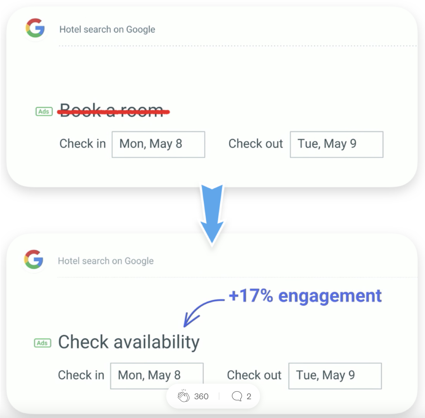
Microcopy should be actionable — because most users need a slight, indirect push. This is why best practice is to include action words (active verbs) like “try,” “search,” “type,” “explore,” “enter,” “filter.”
You’ll see lots of “learn more,” “read on,” “get info,” “download,” “submit,” “connect,” etc. These are common, and they work, but they’re not going to pervade users’ cynicism. For this, you need to show the benefit, not the commitment.
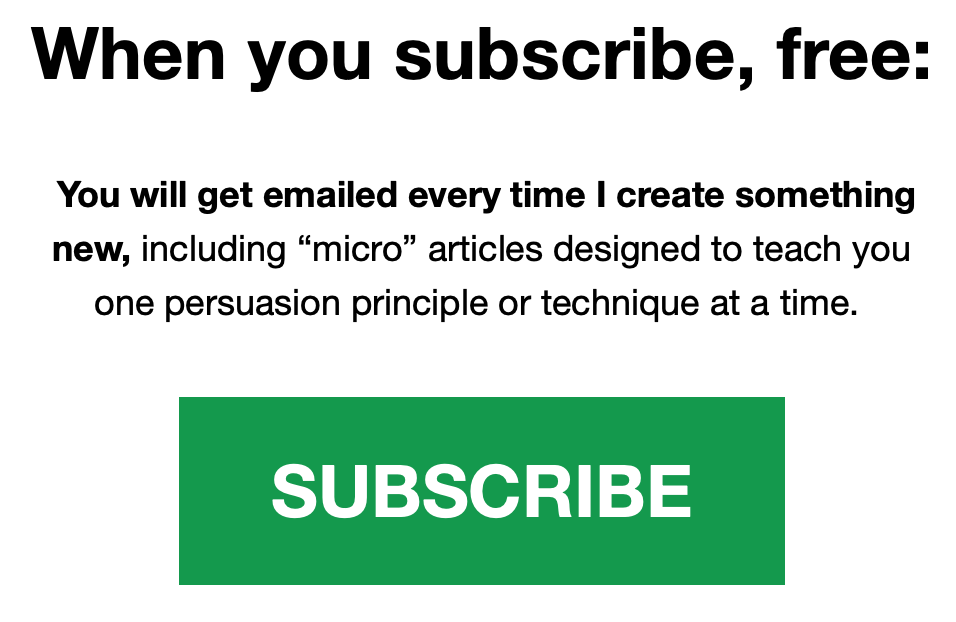
“Sign up for our newsletter,” for example, makes it sound like you’re giving the user a gift — at least in your own mind. You’re not. In an oversaturated world, another newsletter is a commitment; a “hard ask” according to The Startup’s Jano le Roux[2]. Instead, highlight the benefit of the commitment.
Here’s Eddie Shleyner:

Step 3: Name Items With Intention
Use the language your users are used to. This can be tricky. As a copywriter, it is often my job to name things. This can be something quite small, like giving a title to a form field, or something big, like naming an entirely new feature.
I frequently have to nudge my clients away from website menu items like “Dream on” (Packages), “Fly away” (Flights) or “Inspo” (Photo Gallery). While microcopy should have personality, its goal is guidance, not amusement. It exists to reduce, not expand, the mental effort required to understand what’s being said.
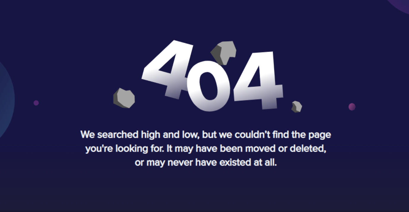
In addition, when you include generous and clear “Success” and “Error” messages,” you confirm that actions have been completed or interactions have failed. This feedback is comforting. Instead of “Image loading unsuccessful,” for example, try something like this:

Step 4: Match the Tone to Your Purpose
Per Step 1, I want you to be clear. But I also want you to try to avoid faceless microcopy like “The transaction was completed,” “Registration was successful” or “Order received.”
Granted, microcopy humor can be dangerous if your company has a reputation for being serious, but you can match the tone and style of your microcopy with your organization’s brand voice.
In an ideal world, great microcopy should make the user feel like they’re talking to a friend; like there’s rapport being built and trust being earned. You might start a sentence with a conjunction, like “And” or “But.” You might use sentence fragments or ask questions (“Don’t I always?”).
Here's Imgur:

Here's Bored Panda:

Step 5: Test Microcopy With Actual Users
When I say “test,” most communicators think of testing headlines, calls-to-action and perhaps even visual elements like colors or photos. Indeed, Mastering The Call To Action[3] indicates that most people are testing:
- Call-to-action buttons — 30%
- Headlines — 20%
- Layout — 10%
- Copy — 8%
OK, but measure the microcopy too, to evaluate its clarity and ensure that it resonates with your target readers, not just with you and your team.
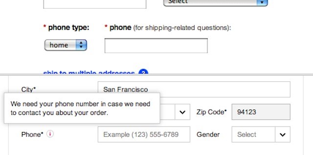
In a usability study by Baymard Institute[4], customers felt their privacy was being invaded when they were required to enter seemingly unnecessary personal information, like a phone number, without any further explanation or help. However, users were far more forgiving when the reason for requesting the information was clearly visible and in a logical place. Take a look:

Step 6: Don’t Be Afraid to Over-Explain
Nudging comes with risks. Per Sunstein[5] (2016), “Some nudges produce confusion on the part of the target audience. Some nudges have only short-term effects … Some … are based on an inaccurate (though initially plausible) understanding on the part of choice architects of what kinds of choice architecture will move people in particular contexts…”
This is why, once you’ve followed steps 1-5, you may want to look for places to explain more — like digital product manager Nicolás J. Engler[6], who designed a button with a changing label. When the user clicks on it, the label changes from “submit” to “sending.” This small but thoughtful change lets the user know that the system is working in the background to process whatever they submitted. Once the process is complete, the label changes from “sending” to “done.”
Here's mine, which I feel is singularly appropriate for the bottom of an article:
DONE.
[1] https://www.behavioraleconomics.com/resources/mini-encyclopedia-of-be/nudge/
[2] https://janoleroux.com/?source=post_page-----f734b6e7e2f--------------------------------
[3] https://cxl.com/blog/call-to-action/
[4] https://baymard.com/blog/checkout-experience-seemingly-unnecessary-information
[6] https://github.com/NicolasJEngler
Tiffany MarkmanTiffany Markman is an international speaker, trainer and writer, known for her work on communication, messaging, marketing and more. She’s collaborated with over 450 brands worldwide — both big and small — over the last 17 years, encountering writing that ranges from the sublime to the absurd. She’s also delivered keynote addresses, created masterclasses and presented training in 14 countries. Markman likes her coffee strong and black, her paragraphing short and tight and her apostrophes in all the right places.